12 Obvious User Experience Mistakes That Could Ruin Your Conversion Rate
Conversion is the process of causing something to change from one form to another. In marketing, it’s turning visitors into customers. An important metric in measuring conversion is conversion rate.

Conversion rate = the percentage of visitors to your site who take the action that you desire them to take, whether that means completing a form or buying a product or service.
Many factors contribute to a successful conversion rate. In this article, let’s dive into twelve user experience mistakes that could cost you dearly.
1. Changing the brand identity elements: The Nordstrom story
117-year-old upscale retailer Nordstrom is still strong in business because of its signature brand identity. But what a management change could do to a company can be seen in Nordstrom’s “Reinvent Yourself” campaign of 2000, which took the brand back quite a bit.
The company has 365 stores across 40 states in the United States. All of these stores have the same highly inviting, simple façade with the impactful, full-caps black-and-white logo of Nordstrom stretched across it.
Also, there is a lobby leading inside that adds to the magnificence of the storefront.
Nordstrom’s brand identity is signified by a lot of empty space around its products and calls to action and use of black (among others) as the primary brand color.
The brand exudes panache that appeals to the upper class looking for designer outfits.
Nordstrom’s e-commerce site extends its Spartan storefront design.
If you look at the home page of Nordstrom, you would be wondering how to add those beautiful designer outfits to the cart. There is no “add to cart” or “shop now” button anywhere.
The entire home page is an inviting array of products and features with exceptionally well-shot photos. And there is only one accent color, black, and a lot of empty space.

Image 1 – Nordstrom Home Page
It’s clear that Nordstrom is not for your average Joe, who goes to Amazon, types in “jeans”, and selects “Price: Low to High”. It’s more about relationships than retail.
But back in 2000, Nordstrom, which had undergone a management change outside the family, started the “Reinvent Yourself” campaign with glaring use of red and other colors.
Unfortunately, the inane media selections, blatant disregard of the elegant black, and crudeness in place of subtlety foiled the campaign

One thing we need to learn from this is how a brand appears to its customers. If you are trying to change your brand image, do it in a way that doesn’t distance your most loyal customers.
Give a lot of thought while designing everything around your brand website. The colors should be chosen from among the web safe colors list. Typography should be chosen with a few important points in mind. Your website should be a natural extension of your physical stores.
2. Not providing all possible payment modes
If conversion has to complete, the customer should be able to pay. So, payment convenience is extremely important. These days, e-commerce sites have begun to understand the value of providing every possible payment option to the customers.
Payment through options other than net banking and credit cards is getting popular. Check out home improvement shop Build.com’s payment page providing the additional options such as Amazon Pay and PayPal.

In order to maximize the checkout page experience for your customers, provide additional payment options and try to provide all checkout details on the same page. Here are some additional payment gateways that you can use:
- Authorize.net
- Amazon Pay
- Google Checkout
- Stripe
- Masterpass
- 2Checkout
- PaySimple
The Baymard Institute study into the top 50 e-commerce checkout pages gives you a clear idea of how a checkout page should be.
3. Putting up advertisements: The TOI story
If you visit the Indian newspaper major The Times of India (TOI), the first thing you see is a completely unintuitive, non-relevant, and non-user-friendly full-page ad. After the ad redirects you to the homepage, you see close to 30 image, video, and text ads strewn all over the place.
There are a large number of videos also. You cannot watch a single one of them without watching an ad that can’t be skipped.
Besides these, there are movie trailers, irrelevant links, and content from sister sites (music, TV shows, jobs, courses, etc.) More than half of the links on the homepage redirect you to a sponsor or a sister site.

Forget user experience — it’s the usability that is at stake here.
TOI has gadget listings on its homepage, but too many advertisements ultimately results in low conversion rates for these products.
Regular visitors to TOI train themselves to focus only on the tiny box at the top labeled “Top News Stories” and another one below labeled “Latest News.” That’s where you have what you want — news. Most visitors ignore the rest of the website.
Among e-commerce sites, you can see ads on Walmart, which serves geographically targeted Google ads.
Advertisements don’t augment your UX and only serve the purpose of moving your users out. So, if your plan is to get high conversion rates, avoid ads.
4. Aiming for high YSlow score without real content optimization
A normal WordPress blog using a free theme and not too much content on the homepage could achieve a higher YSlow score than a professional blog such as TechCrunch. But the professional blog may still provide better user experience. How so?
Your YSlow score is dependent on your final loading time, among other factors, not just the time it takes for the user-facing content to load on the browser.

Sites like TC load its user-facing content faster, usually within 2 seconds. And they use several technologies, including a CDN, server software such as Nginx, and caching engines such as Varnish, to achieve the speed.
Professional blogs may also have optimized HTML that loads much faster. The background scripts and other elements may take longer to load, deteriorating the YSlow score, but the user essentially has already seen the entire website.
In essence, a high YSlow score may not always correlate to fast content loading, so it has less to do with better UX.
In the following image, Quicksprout loaded the user-facing content faster than TechCrunch and ZoomOwl, but ZoomOwl still has the highest YSlow rating. TechCrunch showed up on the browser within three seconds, but took the longest to finish loading the entire content.

You need to have your site loading within 3 seconds for impatient mobile users today. Any more delay could cost you dearly in conversions. A few front-end and back-end optimizations can help your site load much faster.
5. Not following accepted standards and intuition in design
Google Merchandise Store is the e-commerce site run by the search giant to sell its branded merchandise across all of its brands—Google, YouTube, Android, and Waze.

The first thing you notice about this well-converting ecommerce site is its simplicity and basic intuition. As soon as you enter the site, it shows you a map and asks you to select your location. When the store loads, you will notice how it abides by the accepted standards:
- Simple menu with all the items grouped in categories
- Search box at the top right
- Cart icon at the top right next to the search box with the number of items on it
- Customer support number, email address, shipping information, FAQ, and other relevant information on the footer
- Ability to check out with a Google account or as a guest
This is a very simple and accurately built e-commerce site. It has all the elements in place and there is no promotional extravaganza, save for a “Sale” menu item in red at the top.
The diagram below shows the accepted standard for an ecommerce site today.

If you follow the accepted standards of design, your users will feel comfortable on your site.
6. Not providing enough visual information
Your product is somewhere in the warehouse — not in front of the user. So, your customers can’t touch or feel it. Hence, show them plenty of photos and videos.
Product photos should be captured from all angles. Also, ensure the photos are of the highest possible quality with the absolute best lighting. Ecommerce giants invest in professional photographers to take the snaps that really sell.
Check out Bang & Olufsen, which provides high-quality, multi-angle photographs of its products in transparent background and a few images with the product placed as part of a home décor.


By the way, having photos alone won’t be enough. You may create rich product videos providing the usage instructions of the product. They can really help bring more conversions.
7. Not having breadcrumbs at the top
If you have a site with a lot of product categories, people need more than a menu at the top to be able to find their way through your site—enter breadcrumbs!
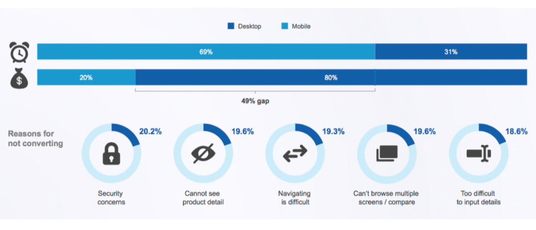
SmartInsights Ecommerce Conversion Rates study of 2018 finds difficult navigation to be a user experience issue causing non-conversion 19.3% of the time.
Check out Amazon.com, eBay, or Walmart. They allow the visitors to get back to your previous page effortlessly with those tiny breadcrumbs organized in this format:
Department > Sub-department > Item category > Item
In addition to breadcrumbs, implement a progress bar on the checkout page. Users should be able to go back and make any modifications as well.
8. Search fails to rank the selling products
I wouldn’t call Amazonthe best-designed and most intuitive of all e-commerce sites. In fact, personally I would love to see a few improvements there.

Having said that, Amazon indubitably leads the ecommerce scene with a “redonkulous” conversion rate of over 74% for Prime users and 13% for non-Prime, while most of the industry’s conversion rates top at 3%. This has a lot to do with the trust in the brand and parameters other than the site UX itself.
One key contributor to this huge conversion rate is that universal product search box stretched across the top of the Amazon website.
Every visitor to Amazon types in what he wants in that box, and Amazon is able to bring up the most relevant and most conversion-optimized results to him.
Ranking in Amazon is wildly different from ranking in Google. Google “sells” information, but Amazon sells products.
Amazon is least bothered about uniqueness in product descriptions and hundreds of backlinks. Amazon will rank a product as long as it has high conversion. And sellers achieve high conversion with a compelling description, great images, keywords on title and description, and as much product details as possible.
So, for your ecommerce site to provide the best user experience, have a good search feature in place that ranks the relevant, high-conversion products to your visitors.
9. Poor sorting & filtering options
Your user would want to sort the product listings every which way.
Most ecommerce sites provide a few sorting options, but they could add much more than that for better UX.
For instance, Amazon allows you to sort by price, customer reviews, and newest arrivals. EBay allows sorting by time, price, and distance. Walmart allows you to sort by best sellers, price, rating, and newest arrivals.
Filters on the products are also equally important. Most e-commerce giants place the product filters on the left-hand side, before the product details.
The filters will give you several options to narrow down to the product that you want to buy. Also, the filters differ based on the product in question: Clothes have different types of filters than smartphones.
Providing an intuitive interface to filter is also important. It’s much better to give the user the choice to select all the filters in one shot and then apply them, so that the page reloads only once. But sites like Amazon provide filter checkboxes and immediately reload the page when a user checks a filter.
Reloading the entire page for every filter could deteriorate UX a little bit, unless your site loads exceptionally fast. Even with that, AJAX-based product listing could be even better for UX.
10. Going frugal on product details
Ecommerce sites are far from physical stores, where you can look at a product from all angles, try it on, touch and feel the material, and see the size and fit in real time.
For much improved user experience and better conversion, you have to provide all relevant details of the product.
Relevant details depend on the product itself. For clothes, measurement, color options, fit, material, etc., are relevant details.
For a laptop, the RAM, processor, warranty period, return/exchange details, etc., are relevant. Provide all the details in the product description for the buyer to make an informed decision.
Sellers on eBay do this well. In order to improve product conversion rate, eBay sellers provide maximum details on the product pages. Only those sellers make high conversion rate on the competitive eBay platform.
It is also very important to provide stock details. Nobody wants to check out the product and go to the final payment stage and then realize that the product is no longer in stock.
In addition, the most essential information for checkout should be right above the “add to cart” button. For instance, a pair of jeans cannot be checked out without selecting the size, quantity, and color. Those options should be above the button.
11. Not providing in-depth shipping information

Reasons for abandoning carts in the U.S. 2016-2017 published by eMarketer is a very insightful research into shopping cart abandonment. It identifies expensive shipping, no free shipping, not providing shipping costs, slow shipping, etc., as individual reasons for cart abandonment.
Among the top eight cart abandonment reasons, four are related to shipping.
So, provide your users with incredibly detailed information on shipping. The costs, time taken, options for faster delivery, etc., are extremely important.
12. Not communicating well enough
The buyer needs detailed communication about his purchases, and through all possible channels.
Immediately after checkout, a text message and an email should be triggered confirming the order.
Then regular updates on shipment, transit, and delivery should be provided through text and email notifications to the user. Before delivery, a message should be sent with the delivery agent’s phone number.
In addition, Amazon provides the option to “leave the item with a neighbor.” This is an additional convenience that highly improves the user experience.
Customer support is another form of communication, and it should include phone, chat, and email support options. The user should be able to get in touch with a support agent very quickly and on demand.
Conclusion
User experience is important for all kinds of sites, not only ecommerce sites. And there are sites that do it well.
When it comes to designing for the top dollar, invest in a user experience designer. According to Roman Nurik, design advocate at Google, “Investment in UX is often the difference between businesses that grow and those that sputter.”

According to NEA’s Future of Design in Startups Survey, great UX design leads to the following benefits:
- Higher sales
- Better customer retention
- Improved customer engagement
- Faster product cycles
So, to dramatically improve your conversion rate, invest in UX.
How will you improve your own website UX?

0 Response to "12 Obvious User Experience Mistakes That Could Ruin Your Conversion Rate"
Post a Comment